Grphx // Multimedia

27/03/2011

Updates

I don't use blogger anymore, as you may be able to tell. I mainly use my Tumblr now for my university blog and recent work.

Forthcoming Portfolio

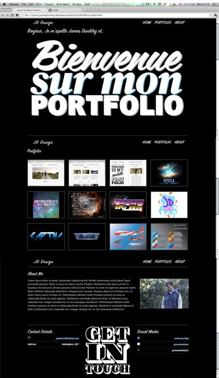
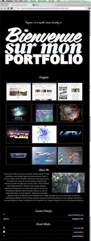
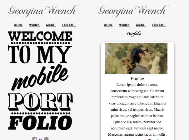
Just need to get some webspace and its ready to go live! I designed my site to work on iPad, iPhone, and Mobiles. Here are some screens! Valid HTML5 & CSS3!

Website version of my Portfolio 


iPad version of my Portfolio


Mobile version of my Portfolio


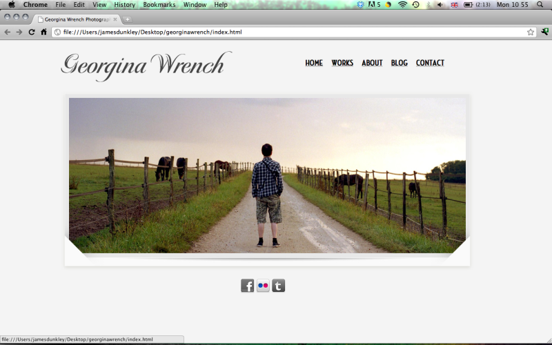
Client site

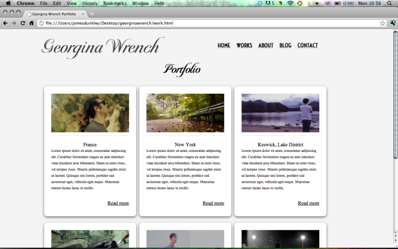
Here are a few screens of a site I designed for a friend of mine who's a photographer. Valid HTML5 & CSS3.


Mobilized Version of the site.


Please visit my Tumblr to keep updated with my work until my portfolio goes live!!

27/10/2010

Possible 12"


Heres a 12" sleeve i designed for my friend.

21/10/2010

WorldWideWeb Interpretation


In our lesson we drew simple diagrams of the way we perceive the world wide web. I re-did our groups cuz honestly it was quite poor (aesthetically!) Here's my new version!

x

15/10/2010

20 IMGS


We had to bring in 20 images that represented ourself. I fancied creating a collage instead of using p/s, although i'm annoyed that i don't have a printer as i want to add a lot more too it.

14/10/2010

Design Site Review 3


WWW.AMAZEELABS.COM


AmazeeLabs is a Web Design/Networking Website all in one. It was created Gregory Gerhardt and Dania Gerhardt. (I'm guessing their married) The design of the website is very unique, and has a very organic feel to it. The colourscheme works very well, although there are a lot of different colours on the page. I also really like the grainy / paper / canvas effect that they have applied to the website, making it feel a bit more welcoming to the viewer. The site is very easy to navigate with the buttons at the top providing everything you need, the front page show's off what they have to offer and is very eye catching! I also really like how they have used speech bubbles for the text boxes, although I have seen it before, I've never seen it used they way they have. They have added some good interactivity into the website, showing a Twitter feed at the bottom, very nice galleries for their work, and also the slide down banner that appears when you click on the newsletter icon. I think this website really works, it stands out from the others, even though it is a simple basic layout, it's the little things that make it what it is

Design Site Review 2


WWW.FINSTAFARI.COM


Finsta is an Illustrator / Graphic Artist from Sweden, I couldn't really find much more information than that, but surely it's the end product that counts right? He uses very bold lines & colours and has a very unique style. He has worked for client-el such as MTV, Diesel and also has been known to create a "tasty" Menu!
His website is very tidy, although there is not much too it, it works very well. Starts off as a simple clickable image, taking you to the main website. All of the information is clearly displayed on the left hand side of the page, which are clickable buttons. This then takes you too a series of examples of his work, depending on what type, which again is a clickable button that opens a new window, displaying his work. There could be more interactive aspects on the site, especially with the way things are going in web design, but I am a massive fan of simplistic design. In my personal opinion I think the website would look better centered in the middle of the screen, and maybe enlarged a bit.